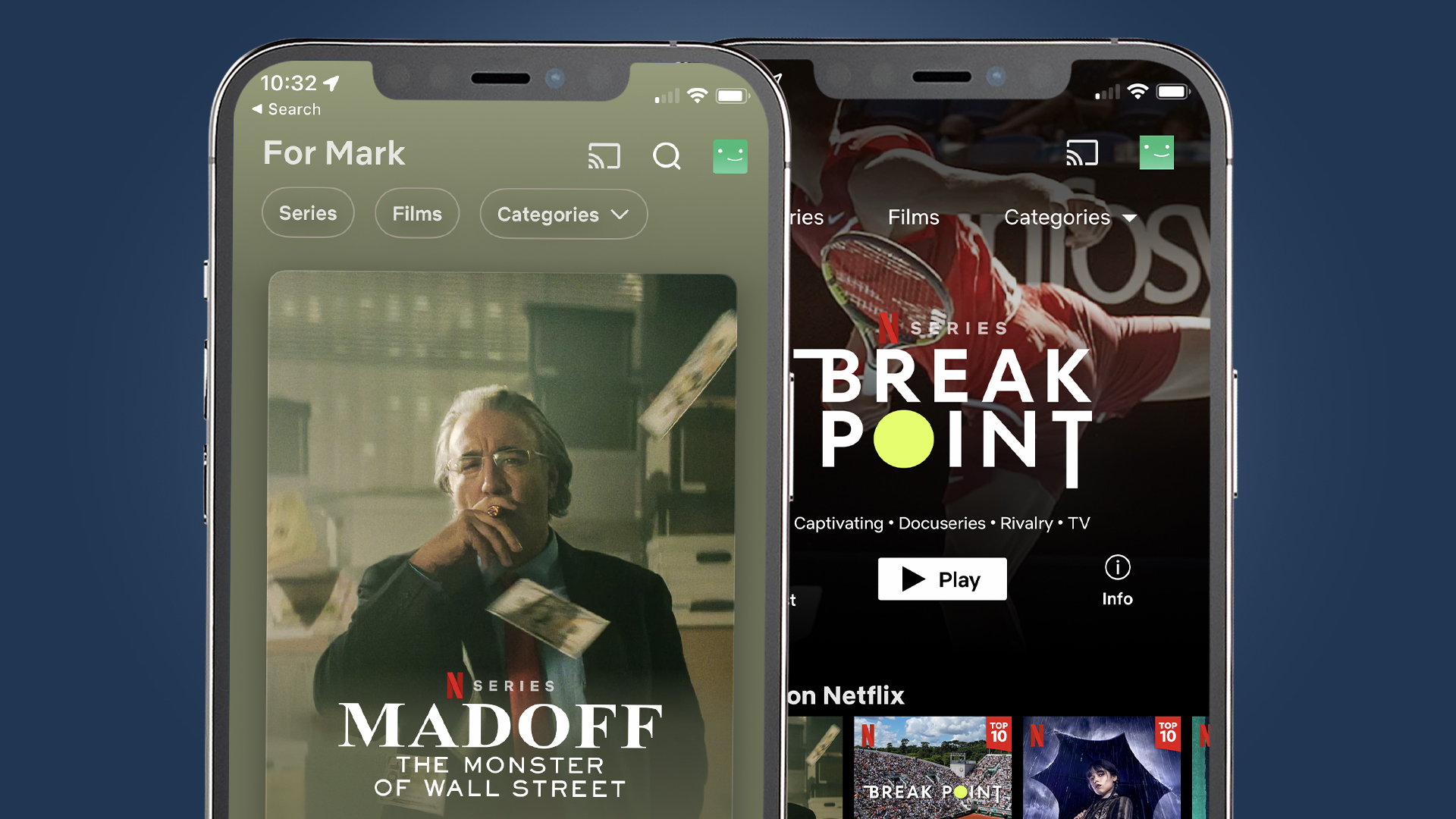
Netflix's iPhone app has been given a welcome redesign with lots of visual flourishes, but it's still missing some much-requested features.
The updated iOS app, which you can get now by going to the Netflix app in the App Store and tapping 'update', mainly delivers a host of user interface upgrades. These include fluid transitions that make the app feel a bit snappier when you tap on titles and some new wallpapers that make the app feel more vibrant.
The main functional tweaks are that the search icon has been moved to the top of the screen next to some redesigned filters that include searching films or TV shows by category. This makes it a little easier to leaf through Netflix's vast catalog.
Interestingly, the search icon on the app's bottom row is now a 'Fast laughs' section, which lets you scroll through a stream of short clips from Netflix's comedies and stand-up shows. It feels a bit like the streaming service's attempt to create a TikTok-style feed for its own content, but we'd prefer to see something more useful here.

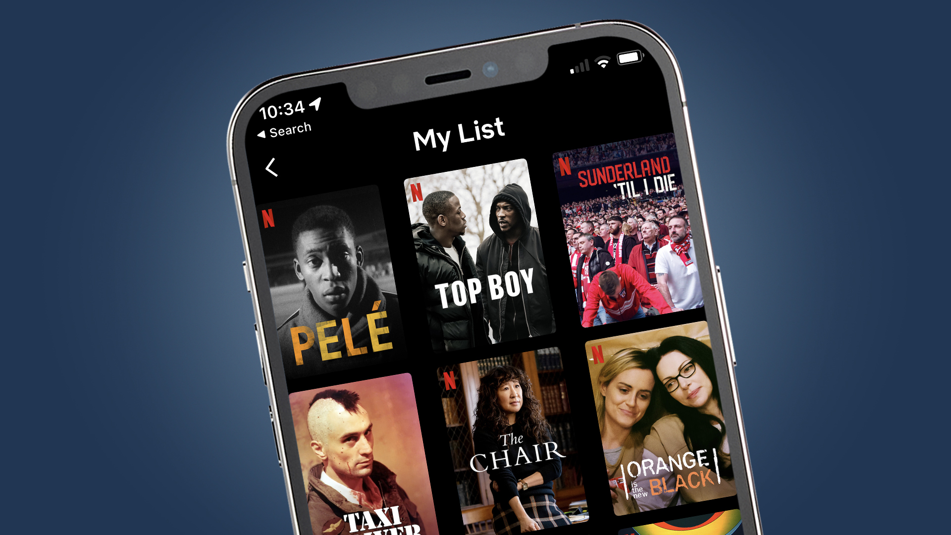
For example, the 'My List' function is still somewhat buried in the profile section in the top-right corner of the app. Most users would likely prefer to see that in the bottom row. Also, there's frustratingly no option to re-order this watch list within the app – the ability to manually re-order your titles was something that Netflix removed in 2021.
Still, it seems this is just the first stage in Netflix's redesign of its mobile apps, for iPhone at least. Developer Janum Trivedi, who previewed the refreshed app on Twitter, said the visual updates were "just a starting point". We've asked Netflix if the same improvements are coming to Android too and will update this article when we hear back.
Analysis: A good start, but is Apple TV next?

Netflix's updated iOS app is definitely a visual improvement – we particularly like the accelerometer-driven moving reflections you can see on images when you turn your phone. But the Netflix experience certainly isn't uniform across devices, and one that's also crying out for an update is the Apple TV app.
Compared to the new iOS app, Netflix's Apple TV app looks like it hails from another era, with a sluggish user interface and a lack of features like the 'shuffle' play button. The Netflix app also doesn't support the 'Up Next' function of Apple TV that lets you see shows from various streaming services on your home screen.
The reasons for these omissions are likely due to some historical tensions between Netflix and Apple. Last year, a tweak to Netflix's 'sign up' page in its iOS app saw it send users to its own website to finish signing up, so avoiding the 30% cut that Apple takes from all in-app purchases.
We won't hold our breath for a more visible and tweakable 'My List' function in the Netflix app – the recent changes confirm that the streaming giant would prefer to have control over what new content you see. But the new visual changes are mostly an improvement and will hopefully be just the start of a revamped Netflix mobile experience.
from TechRadar - All the latest technology news https://ift.tt/rmlMRTd
0 comments:
Post a Comment